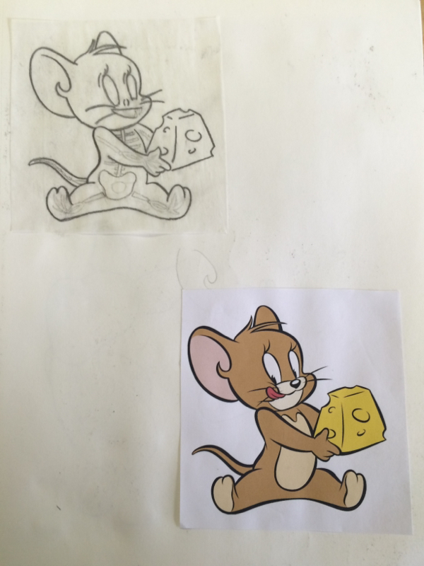
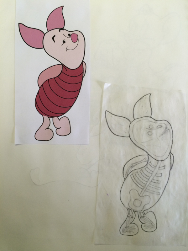
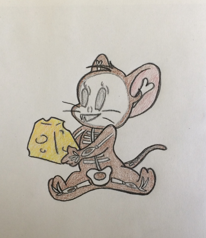
For this project, we had to create a skeleton out of a cartoon character. First we had to print out two cartoon characters that had a fair amount of detail. Then we traced the outline of these cartoon characters onto a sheet of tracing paper. Once we did this we filled in the outline with bones to create a skeleton. I decided that I liked the way that my Jerry character turned out better so I decided to use that for my final. To create the final, we had to trace the outline of our character into our sketchbook and use the first bones that we drew as a guide for our final and color it in.
Another project that we worked on in class were modified contour drawings. These were very similar to the blind contour drawings, however, we were allowed to look at our paper while drawing our hand. Overall, I am pretty pleased with how my hands turned out. I feel as though it is a big improvement from the blind contour drawings that I did and it is very easy to make out the shape of the hand and they were much more proportionate to my actual hand, unlike my other hands. I feel as though I had a much better experience doing these drawings rather than my other hands. I do not however, think that my bookbag drawing turned out very good. This was a much more difficult drawing to do as the object was much bigger and there were a lot more creases and details that I had to pay attention to. In class one day we worked on blind contour drawings. How we did these drawings was by putting our pen down on a point on our paper and our hand in a position; then we had to attempt to draw our hand without lifting our pen off the paper while focusing on one section at a time and paying close attention to detail. The point of doing this was to try and focus on what our hand actually looked like and not what we thought it looked like. As you can clearly see, these were quite hard to do and still get a good representation of the hand. My biggest difficulty for me I believe was getting my hand to be its actual size. All of my drawn hands were significantly smaller than my actual hand. Overall, I feel as though this was a good experience as it made me realize how even if you think you know how an object looks, it's not going to be realistic without paying close attention to detail and the actual object itself. After practicing hand drawings, we had to create an animal out of our hand. First we had to do a little research and decide what animal we were going to do with two reference photos for each animal. I decided to work with an elephant and a goose. After sketching out two elephants and two geese, I decided to model my final one on my first goose sketch. I was pretty pleased with my final product and thought this was an enjoyable project. Working with shape shading and value is a very important part of creating a 3 dimensional looking object on a 2 dimensional plane. The way we learned how to create value was by first creating a value chart. The concept of this didn't seem too challenging but by the time I got to the last few shades, I had a hard time applying more and more pressure. Using this value chart, we incorporated these shades into a shape. We began drawing our shape by creating an outline and selecting a light source. Then we gradually began to shade our shape following the contour of it and applying less and less pressure as we moved toward our light source. After this we created a cast shadow. I found that the hardest shape to add value to was the cube because we had to have a clear outline of the shape while still having dark values. My material preference for creating these was charcoal. Even though it was very messy, I liked how easy it was to apply different amounts of pressure using it. I chose to do my final project with charcoal. For our final project we had to have all three shapes on different planes and have a clear light source and shadows. Overall, I enjoyed my experience working with value and shading. I feel as though I learned a lot about oil pastels while working on this project. One thing I learned about was how to create value with color. The technique I used was to start off with the medium value and then layer over that with lighter and darker values. This helps to prevent the creation of harsh lines between two colors and gives the colors a smooth transition. Another essential aspect to give the shapes depth and value was to select a light source and start lighter on the side where the light source is and get darker while moving in the other direction. My light source came from the upper left hand corner. This created value which is necessary to give the shapes a 3 dimensional look while working on a 2 dimensional canvas. |
AuthorArchives
April 2015
Categories |